Anmerkungen zum Werk von Henri Matisse
„Das Wahre und Wirkliche in der Kunst beginnt erst dann, wenn man nicht mehr begreift, was man tut und was man kann und dennoch eine Kraft in sich spürt, die um so stärker wird, je mehr man sie verdichtet.“
„Ein Künstler ist nur derjenige, der in der Lage ist, seine Empfindungen methodisch zu ordnen.“
Diese beiden Textzitate von Matisse zeigen die beiden Seiten in seinem Werk. Auf der einen Seite das Spontane, Materialgsteuerte und Zusammenhang schaffende. Auf der anderen Seite das Geordnete, rational Gesteuerte und die Formen trennende. Matisse bringt beide zum Ausgleich.
Es ergibt sich die paradoxe Situation von 2 Tendenzen. Die erste, die Tendenz zur Harmonisierung, die zweite, die Tendenz zur Polarisierung.
Eine mögliche Formel für seine Bilder könnte lauten, Matisse sucht Entspanntheit mit Mitteln der Spannung.
Er schafft so einen Ausgleich, eine Verbindung zwischen den spontanen und den rationalen Welten der Malerei.
Mit Cézanne und van Gogh geht die Phase der Simulierung von Tiefenraum in der europäischen Kunst zu Ende. Von diesen Beiden ausgehend entwickelt sich die moderne Kunst. Auf beide lassen sich die unterschiedlichen Strömungen der ersten Jahrhunderhälfte des 20 Jhds. zurückführen, bis in die 60er Jahre.
Für Matisse ist die Linie der Bezugspunkt, die von van Gogh ausgeht. Van Goghs große Leistung für die europäische Kunst war die Wiederentdeckung der Fläche und die Auseinandersortierung der Farben und Formarten. Ein wichtiger Einfluss hierzu kam vom japanischen Holzschnitt.
Die wichtigsten Elemente:
Trennung der Formarten.
Trennung der Farben.
Übersetzung von Raum in die Fläche.
Und die beiden erwähnten Tendenzen, diejenige zur Harmonisierung und diejenige zur Polarisierung, zur Trennung der Formen.
Bildbeispiel:
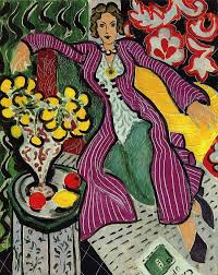
Ein zentrales Sujet geht bei Matisse auf die orientalisierende Tradition der französischen Romantik zurück, im Besonderen auf Delacroix und genauer auf das Motiv des Harems, bis zu Matisse ein Bild der Faulheit und Pracht. Die üppigen Intérieurs von Matisse beziehen sich auf diese Tradition. Matisse verändert das Schwüle des Themas, indem er Kostbarkeit mit Kühle und Distanziertheit verbindet und das Pittoreske, Glitzernde, das die Romantiker suchten, bei ihm keine Rolle spielen. Bei ihm liegt die Pracht in der abstrakten Ornamentik.
Das Bild vermittelt Ruhe, müde Entspanntheit. Und paradoxerweise ist das Bild aus vielen Kontrasten aufgebaut.
Diese Quadratur des Kreises, Harmonie mit Hilfe von Kontrasten zu schaffen, die Spezialität von Matisse, geschieht auf vielfältige Weise.
Die Harmonisierung ergibt sich aus der Häufung der Formarten und durch Ähnlichkeitssysteme unter den Formen.
Der gemeinsame Nenner aller Formen besteht aus der sich schlängelden Linie. Sowohl in den großen, wie auch den kleinen Formen. In der großen Form, die umlaufende Linie der zentralen Figur, die sie vorsichtig in der Fläche verzahnt und gleichzeitig trennt, heraushebt und sie durch das überall vorkommende Schlängeln harmonisch integriert. Ein weiterer Zusammenhang im Bild entsteht dadurch, dass alles gemustert ist.
Dasselbe Prinzip wendet Matisse bei den Farben an.
So ergibt sich in Bezug auf dieses Bild und andere dieser Machart die Beobachtung, dass Matisse Kontraste schafft, indem er Formen trennt und gegenüberstellt und gleichzeitig diese Kontraste auflöst und zu einem harmonischen Zusammenspiel bringt.
Gehen wir zum nächsten Element über, der Flächigkeit. Man kann sagen, dass Matisse die malerischen Epochen in die Fläche übersetzt.
Auf den Punkt gebracht hat er dieses Problem in seinen späten Scherenschnitten. Zur Erinnerung, Matisse hat dazu Papiere mit Farbe bemalt, anschließend Formen ausgeschnitten und daraus Figurationen zusammengestückelt.
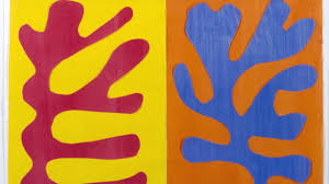
Der organische Eindruck im Bildbeispiel ensteht durch die Ähnlichkeit mit Wachstumsvorgängen, die Formen haben keinen Abbildungscharakter.
Der Kontrast liegt im Hell-Dunkel der Form zum Grund. Es ist ein Kontrast einfacher Flächen ohne Valeurs, ohne interne Formbeziehungen. Diese spielen sich an der Grenze ab, die dadurch mit hoher Intensität aufgeladen ist. An deren Rand läuft unser Auge die Form ab, es entsteht ein Fließen. Der Umriss wird übergangshaft und zeitlich. Die innere Form expandiert, was Picasso dazu bewegte zu sagen, dass die Farben von Matisse ihren eigenen Raum schaffen und sich ausdehnen.
Noch erwähnenswert in diesem Zusammenhang der Satz von Matisse, dass die Kunst in der Oberfläche liegt, was ihm den Vorwurf des Dekorativen eingebracht hat.
Zusammenfassend:
Trennung der Formen und Farben erzeugt Polarisierung und Kontraste.
Harmonisierung durch Häufung der Form- und Farbkontraste mit vielen verwandschaftlichen Beziehungen und Übergängen.
Folgen:
Die Polarisierung führt zur Pop-Art, im Besonderen zu einem anderen „Vorläufer“ dieser Maler, Stuart Davis. Als Beispiel für diese historische Linie können die Paraphrasen, die Lichtenstein zu Bildern von Matisse gemacht hat, dienen.
Durch diese Trennung und Sortierung der Formarten steht Matisse auch am Anfang der konstruktiven Richtungen.
Die andere Tendenz zur Harmonisierung der Kontraste macht Matisse wiederum zum Vorbereiter des spannungslosen Konstruktiven, zu Malern wie Bonnard, Barnett Newmann und Rothko.
„Man muss die Freude im Himmel, bei den Bäumen und Blumen zu finden wissen. Das Glück aus sich selber schöpfen, aus einem reichen Arbeitstag und der Erhellung, die er in den Nebel um uns tragen kann.“ (Matisse)